Yesterday we launched the third iteration of cloudsmith.com
JUST LOOK HOW AWESOME AND BEAUTIFUL IT IS!
The new website is a significant upgrade in every way, from tech stack to color, structure to copy. Absolutely everything with the existing site was poked, probed, questioned, and rebuilt from the ground up.
The project, headed up by our own Paul May, working with DSI, have built something great. A new brand, a new site, and a whole new design language that embodies the Cloudsmith product and mission; to provide world-class support for artifact management, software distribution, and helping companies lower their risk with software supply chain management.
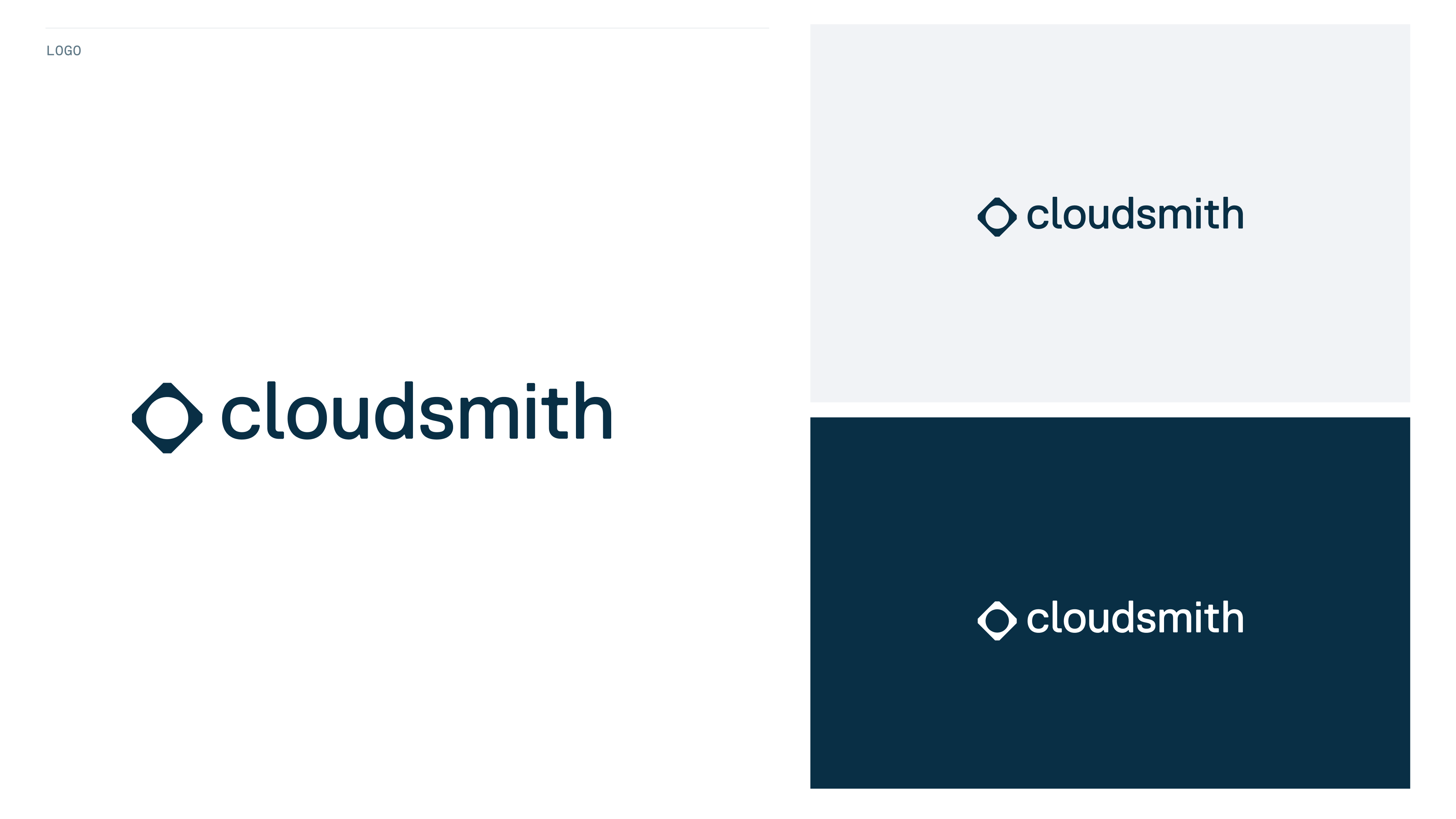
Perhaps the most significant change is the new brand mark. The new logo represents the next stage of evolution for Cloudsmith. We are past the initial startup stage, firmly into scale-up mode, and slowly over time, a maturity has seeped into the company. And the new logo is a reflection of that.
A Brief History of the Original Logo
Cloudsmith was named as such to represent our passion and drive for cloud-native, and a product sitting central to the ecosystem of dev tools for building software pipelines.
There were some fairly obvious attempts (by others) to brand cloudsmith (with a small c here to represent the others that used the name, or variations of the name) as a cloud with a hammer.
When we came to branding Cloudsmith initially we didn’t want to be so obvious. After a few rounds of pitching and discussion, we landed on the mark that we’ve used since 2016.
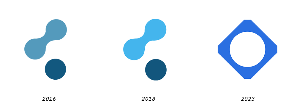
A sort of amorphous blob, that kind of looked like a ‘C’, kind of looked like a cloud (on its side) and kind of looked like the common share icon. Married up to the text mark, in Ubuntu Bold font (we were proud of that choice) we ended up with a logo that remained pretty consistent as it has spread over the internet, events, and merch over the last seven years.
We grew to really love it. We had fun with it. We used to hide it both in plain sight and somewhat subtly in stock images we used for blog images. When we started generating art in-house for the blogs, we’d be creative with it.
It wasn’t without issue though. Its “center of gravity” wasn’t central, and so for places like Twitter where it was enclosed with a box or circle, we had versions where it was off-centered so that it looked central. And over the years, similar logos have appeared in lots of places. But as we were building awareness, we were reluctant to change something that seemed so core to the company, product, and ourselves.
There is nothing permanent except change.
(Heraclitus)
It was time. Time to change. Time to grow up and relinquish some control. Take all the things we’ve learned about the company, the market, and our amazing customers, and distill it down into something new.
Cloudsmith has always been about delivery. Distribution. Providing the artifacts you need, to where you need them. Building software pipelines, deploying software, distributing software to your customers. We provide that fully-managed core infrastructure for you, twenty-four hours a day, seven days a week. It’s foundational tech that drives business value and saves you a lot of heartache.
Everything we do, we do to make developers' lives easier.
The new logo represents that. A simple design (simple is hard, btw) that encapsulates the thematic pipelines and artifacts that drive our value to you. The inner circle harks back to the old logo and where we came from. The mechanical nut similarity emphasizes the ‘smith’ side of building something great.
Check out the new site here: https://cloudsmith.com